How to Build a Whole-Home Paint Palette That Actually Flows
Have you ever fallen in love with a paint colour in one room — only to walk into the hallway and feel like you've stepped into a completely different house? You're not alone. One of the most common frustrations I hear from clients is that their home doesn't feel cohesive. The living room is one vibe, the kitchen is another, and the bedrooms feel like they belong to someone else entirely.
The good news? A whole-home paint palette is the fix — and it's easier to build than you think. You don't need to paint every room the same colour. You need a system.
Here's how I approach it, both for my design clients and for the curated digital palettes.
Start With Your Anchor Colour
Your anchor colour is the one shade that will appear in your most-used, most-visible space — usually the main living area or open-concept main floor. This is the colour that sets the tone for everything else.
When choosing your anchor, think about:
The light in your space. Does the room face north (cool, shadowy light) or south (warm, bright light)? Paint reads completely differently depending on direction.
Your fixed finishes. Your flooring, cabinetry, countertops, and tile aren't going anywhere — your palette needs to work with them, not fight them.
The feeling you want. Calm and airy? Moody and sophisticated? Warm and cozy? Your anchor colour should deliver that feeling the moment you walk in.
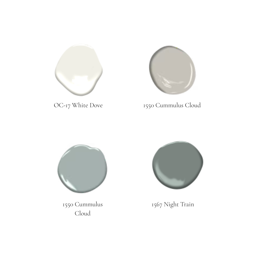
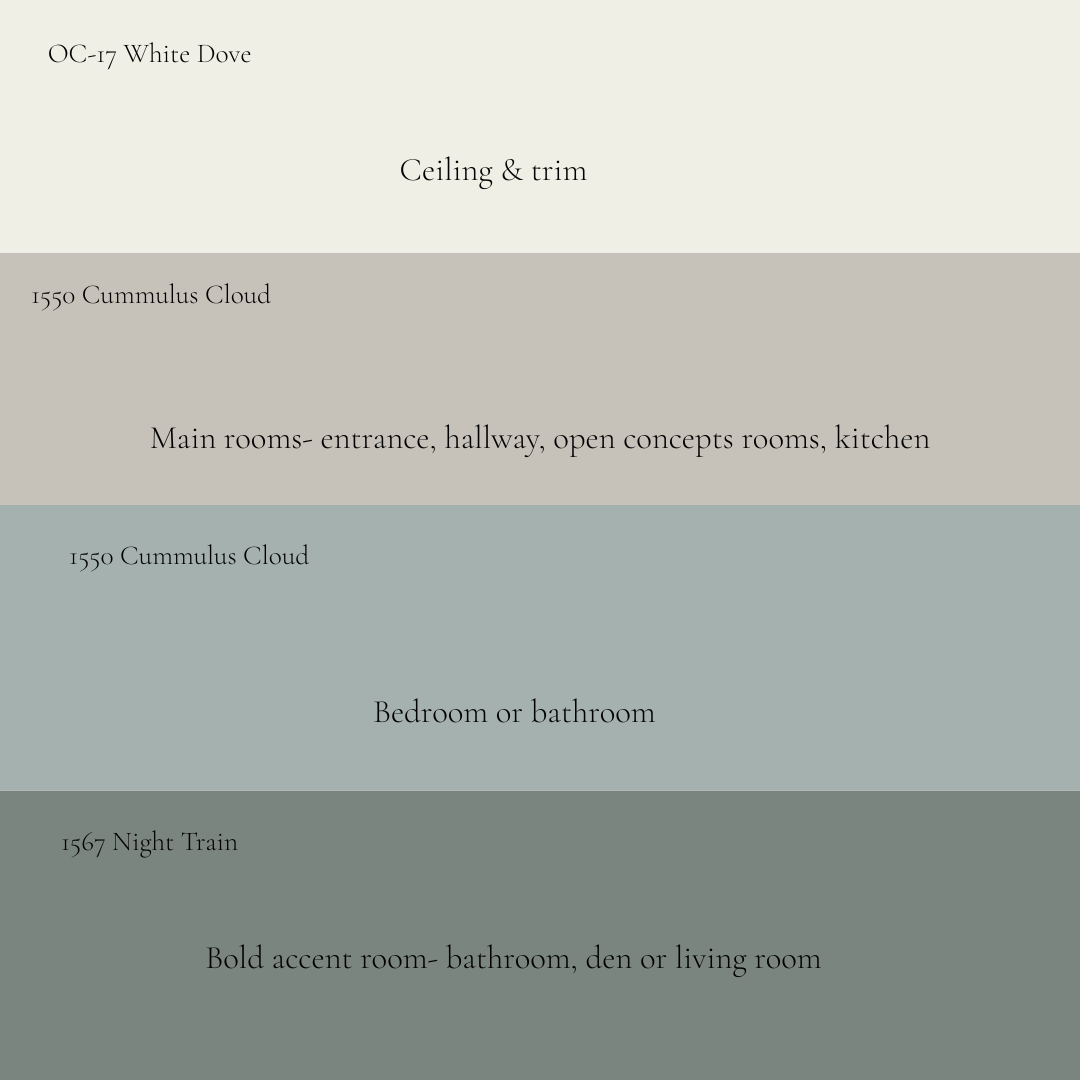
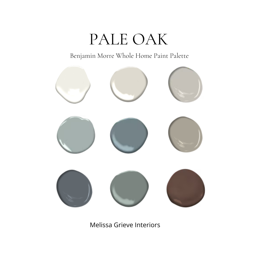
In this palette, your anchor colour could be White Dove if you are going for a light and airy look, or Cumulus Cloud if you want your anchor colour to have more depth.
Choose Your Supporting Colours (The 60-30-10 Approach)
Think of a whole-home palette like getting dressed. You wouldn't wear five patterns in five different colours — you'd pick a dominant colour, a secondary colour, and an accent. Rooms work the same way.
A simple framework I love:
60% — Your Dominant/Anchor Colour (or a close variation of it) — used in your main living spaces
30% — Your Secondary Colour — a quieter complement used in adjacent rooms like a dining room, hallway, or primary bedroom
10% — Your Accent Colour — used in powder rooms, a home office, or through décor and trim to stand out
Once you've landed on your anchor, everything else flows from it.
For a cohesive whole-home feel, your colours don't all need to match — they need to relate.
Pay Attention to Undertones
This is where most people go wrong. They pick what looks like a warm greige on the chip, bring it home, and suddenly it reads lavender or green on the wall. That shift happens because of undertones.
Every paint colour has an underlying hue — often blue, green, pink, purple, yellow, or orange — that becomes much more visible when surrounded by the light and finishes in your actual home.
The trick: pull the undertone from your anchor colour and use it as a thread throughout your palette. If your anchor has a warm, slightly golden undertone, make sure your secondary colours share that warmth. If it leans blue-green, lean into cooler companions.
This is why I always recommend testing paint samples in your actual space — on large swatches, not tiny chips — before committing. Light changes everything.
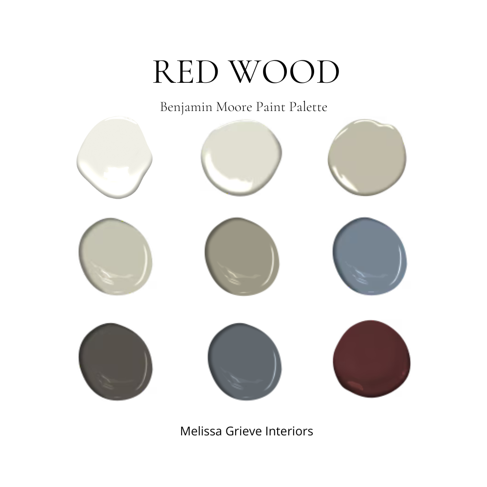
This palette has a deeper moodier feel.
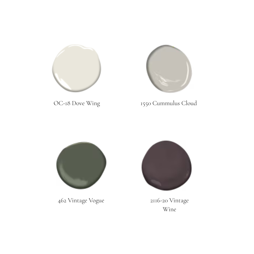
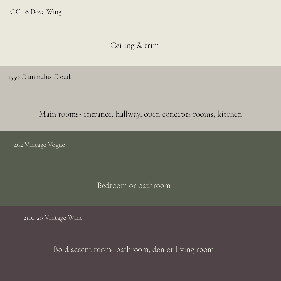
This follows the same approach but with a completely different feel. I like adding one of the deeper colours as accents in main areas — for example, a throw pillow or an accessory.
Pro Tip
For richer, moodier colours, colour drench the room by painting the walls, ceiling, and trim the same shade.
A Simple Formula For Getting Started
If you're feeling overwhelmed, start here:
Pick one anchor colour for your main living space
Choose two companions — one lighter, one slightly different in tone — for adjacent rooms
Select one trim colour and use it everywhere- unless you are colour-drenching a room
Add one bold accent for a powder room or small feature space
Test everything as large painted samples before you buy a full can
That's it. Five decisions. A whole home that finally feels like it belongs together.
Want it done for you? My digital paint palettes in my shop are curated, cohesive collections with suggested pairings and trim recommendations already built in. And if you want a palette matched specifically to your home's light, finishes, and style, my colour design services are available virtually across North America.
Book a Custom Colour Consultation
Check Out My Shop For My Interior Palettes

Have a question about choosing paint colours for your home? Drop it in the comments — I'd love to help.